

90 seconds to better healthcare content marketing reports
Content marketing is a hot topic in digital marketing. And yet, many healthcare providers seem reluctant to participate. Among the roadblocks is an inability to accurately measure the value of content marketing. Fortunately, this roadblock is easy to overcome. And you can do it in about 90 seconds.
Let me show you how. But first, some context.
The need for a content KPI
Smith & Jones publishes lots of content for both our client’s marketing and that of our own agency. That content takes many forms. There’s short-form content (like this blog post that you’re reading right now) and longer form publications like our popular yearly trends report. We also do video, advanced healthcare marketing tools, and even the occasional webinar.
When we measured engagement for each of these content formats, we looked at them in silos. Blog posts were measured by average time on page, while whitepapers and tools were measured by the number of downloads they generated. Videos were measured by the number of users who watched them and by how many users watched them through to completion.
This approach was great at telling us which piece of creative in each category worked best, but it didn’t do anything to tell us which formats we should be spending our time on in the first place. In other words, it didn’t help us answer questions like “Should we keep publishing whitepapers, or switch to an ebook format?” and “Should we do more videos or more blogs?”
What we needed was a yardstick. A standard measurement that could compare any piece of content to any other, regardless of format, and assign a score.
A formula that leads to enlightenment
Through a series of experiments, we settled on this formula:
( {{Pageviews}} / {{Unique Pageviews}} ) * ( {{Pageviews}} – ( ( {{Exits}} – {{Bounces}} ) + ( {{Bounces}} * 1.5 ) ) )
With about 15 minutes of setup, this formula gave us very insightful reports, like the one below. Notice how each piece of content has a unique and granular score, all the way to two decimal places. This kind of detail allows us to measure every piece of content against every other one. It also measures each piece of content against the average for the site as a whole, making it easy to see the great, the good, the bad and the ugly.
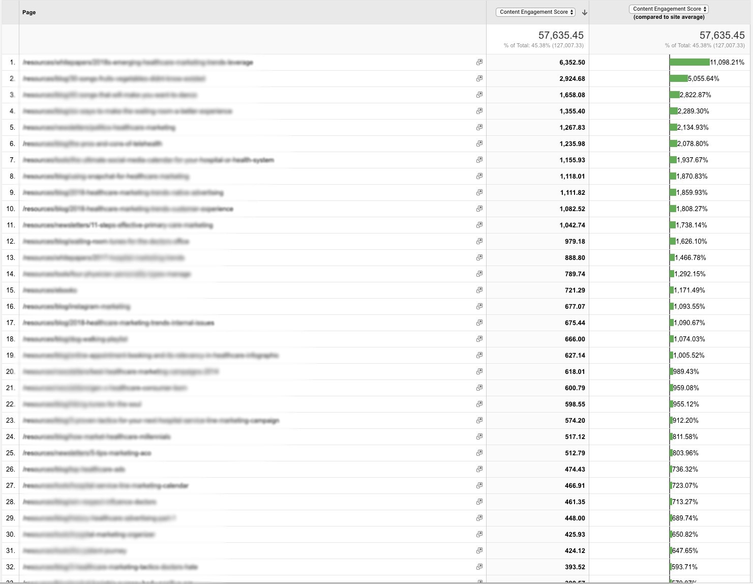
For example, if we look at the column all the way to the right of this chart, we can see, at a glance, that there are three pieces of content that vastly outperform the other content on our site. What’s more is that these three pieces are different formats (one is a white paper, the others are blog posts). The formula doesn’t care what format it is, everyone gets a score.
It’s quick and easy to use this yourself
This formula is free and easy to use yourself. To get it installed, the best bet is to share this article with your web analytics team and ask them to create what’s called a calculated metric in google analytics. They’ll need to make sure they set the formatting type to float. Then, just copy-paste the formula into the appropriate window.
By the way, if you’re a healthcare provider and don’t have web analytics people, you can email me and I’ll help you get it in place.
Once you have it installed, you’ll instantly have data on which content is crushing it and which content maybe should get crushed. To start generating insights, ask questions like “What do our top performing pieces of content have in common?” and “How might we generate content that works as well (or better) than our top performers?” Approached with the right questions, this should be a new, rich source of insights for your team.