The Top Healthcare Marketing Campaigns of 2014
The best of 2014 hospital marketing chosen by our team
2014 has been a year of many changes in healthcare, and as a result, a year of opportunity for creative hospital marketing. Our team rounded up our favorite campaigns from the past year with descriptions of why they caught our attention. Take a look below to see if any of your favorites made the list, and to discover healthcare marketing campaigns you may have missed. We hope they inspire you to create great work in 2015.

Memorial Sloan Kettering Cancer Center, Cancer Care: More Science. Less Fear.
Memorial Sloan Kettering Cancer Center takes a new approach to cancer care marketing in their latest campaign from Pereira & O’Dell. The multimedia campaign breaks through the clutter of their competitor’s cancer marketing efforts with bold color, animated graphics and a deliberate move away from featuring cancer patients and doctors. Powerful text and the reassuring tagline, “More Science. Less Fear.” present MSK as a leader in cancer care, and promises an assured, progressive and optimistic approach to cancer treatment. –Alan Beberwyck, Content Director
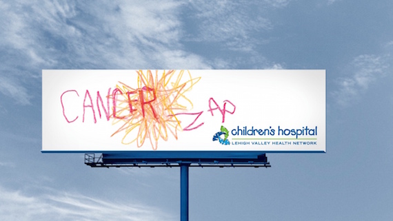
Children’s Hospital at Lehigh Valley Hospital, Kid’s Perspective Campaign
My favorite healthcare campaign this year is the Kid’s Perspective campaign for Children’s Hospital at Lehigh Valley Hospital. I often see healthcare marketing told from the perspective of adults, parents, hospitals and insurance companies, but it’s not every day you see it from the perspective of children. Through video of kids’ perceptions of the hospital environment and staff protecting them with super hero powers, to crayon drawings of cancer getting zapped or thanking a special nurse, this campaign shows a lighthearted personality (even with some difficult subject matter) not typically found in healthcare marketing. –Chris Havens, Senior Graphic Artist
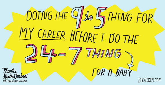
bedsider.org, #ThxBirthControl
My favorite campaign of 2014 is bedsider.org’s #ThxBirthControl. It essentially thanks birth control for helping young women and families plan for pregnancy. Sharable social banners with quippy lines such as “Double espresso and midnight sex are the only things keeping me up at night,” and “9 months from now the only thing I’m expecting to be is more awesome” make the campaign accessible to the target, while a #ThxBirthControl musical puts the cherry on top of a fun, hilarious and empowering social movement. I love this campaign because it changes the conversation on birth control from something taboo to something that should be celebrated. To me, marketing and advertising not only speak to current culture, but help shape it—and this campaign does just that. It empowers women to make conscious decisions about healthy sex and family planning while helping to change the way society looks at birth control. –Ashley Quimby, Administrative Assistant
Capital District Physicians Health Plan (CDPHP), Outdoor
For years, CDPHP spent their outdoor budget on sponsoring a prime, high-visibility billboard that displayed the time and temperature. I know I always looked for that board when driving–and I’m sure I was not alone. CDPHP spent a lot of money to improve the board by making it larger than the standard size and included a cut out, while keeping the creative consistent for 12 months.
Then, in 2013 they gave up their single billboard approach, and since then, CDPHP has been popping up all over the region’s major highways using a variety of creative. The billboards stand out by keeping their message simple, staying true to their brand and changing creative with the seasons. They also utilize digital billboards with unique messaging, different from the typical advertising message. For example, they frequently display reminders of special days or messages about staying safe as school starts, keeping a community-minded focus to their brand. –Rachel Digman, Comptroller
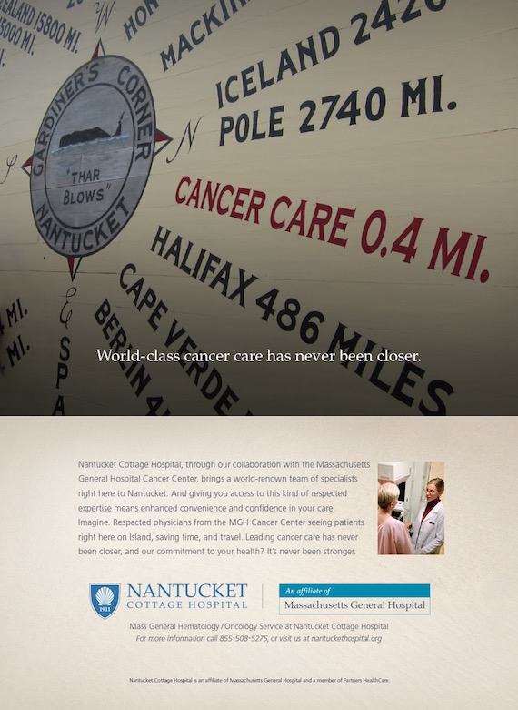
Nantucket Cottage Hospital
The healthcare campaign that I selected, while not being “local” to the Capital Region, is a locally-focused series for Nantucket Cottage Hospital that features well-known Nantucket locations, and is one that connects with me on a personal level. My wife and I spent several summer vacations on the little island off the coast of Massachusetts and our now-6-year-old son had his first summer vacation trip there when he was 11-months old.
Two of the three photos in the ad series by Boston’s Bennett Group use custom photography of Nantucket locations (while a third image disappointingly utilizes a stock photo set in Santa Barbara, CA). One of the ads focuses on the 1936 Gardiner’s Corner compass mural that adorns the side of a building on Main Street. The ad promotes the partnership with Massachusetts General Hospital Cancer Center and the idea that the affiliation brings leading cancer care onto the island, closer and more accessible than ever before. Along with the various destinations (and their respective distances from the island), the mural also lists “Cancer Care” at just 4-tenths of a mile away.
Another of the ads in the series depicts a cyclist peddling along Millstone Road (which leads out to Siasconset on the western side of the Island) with it’s scenic views of the Middle Moors and what is referred to as Nantucket’s “Serengeti.” This second ad is for the Sports Medicine and Physical Therapy services provided, and also uses a bit of a tongue-in-cheek tagline “Your source for ACKtive recovery”, playing off the knowledge that the 3-letter airport code for Nantucket is ACK and you can’t walk 10 steps through town without seeing an ACK sticker on something. This ad won Gold in the 31st Annual National Healthcare Advertising Awards competition. –Dave Mercier, Art Director
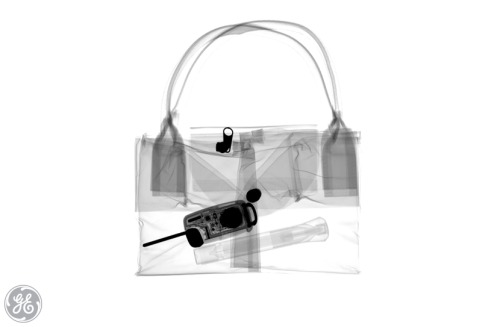
GE Healthcare’s #SeeInsideIt Campaign
My favorite healthcare marketing campaign from 2014 was GE Healthcare’s #SeeInsideIt social campaign to celebrate the International Day of Radiology. I may be a little bit biased, as I was raised by two x-ray technologists, but I still remember going to work with my dad on sick days or snow days, and him x-raying a few of our favorite toys. I still have a film somewhere in my room of a beanie baby where every individual bead showed up, making it look like it was made of styrofoam.
This campaign brings that childlike wonder of imagining the insides of everyday objects to life on its Tumblr blog, #SEEINSIDEIT. The blog features x-rays, magnetic resonance imaging and computed technology films of groceries, toys and little technologies, such as calculators and lightbulbs.
What I love about this campaign is that while you think you’re just discovering these awesome films of everyday objects and pretending you’re wearing x-ray glasses, GE is actually showing you the incredible technology behind their medical devices. It’s a way for the company to show off its innovation without telling you about it directly. The combination of these two ideas makes the posts shareable and entertaining — exactly what you’d hope a social campaign to be. –Caitlin Mooney, Media Strategist

Instituto Oncoguia, “Prostate Poke” Campaign
I think it’s a creative and funny way to deliver knowledge and get men to check up on such an embarrassing, yet important aspect of men’s health. It also shows the power of social media marketing. All they did was utilize the tools Facebook had to offer and they had a huge turnout. I found it not only funny, but super impressive. –Jared Tomeck, Front-End Designer
DDB Brussels – Commissioned by Flemish Government, Don’t Google It Campaign
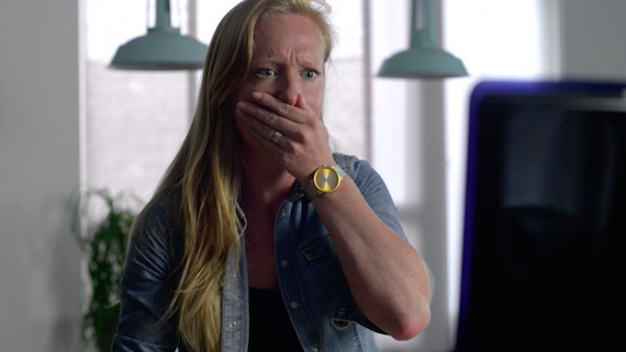
Don’t Google It by DDB Brussels was a fabulous campaign that calls out everyone who’s ever had an ache, pain, or headache and attempted self-diagnosis. Nothing good has ever come from self-diagnoses, other than perhaps scheduling an appointment with a primary care physician or specialist. The campaign combined a humorous depiction of Google-diagnostics and Google Ads targeting the top 100 ailment-related search terms. The message is simple, the content is funny and sharable, and the end-game is effective, driving traffic to gezondheidenwetenschap.be/, which provides visitors with accurate medical information and physician finder resources. –Kate McElroy, Account Manager
Legacy, “Finish It” Anti-Smoking Campaign
My favorite healthcare campaign of 2014 has to be the “Finish It” campaign by Legacy, the organization behind the “Truth” campaign. The campaign aims to shift the perception of smoking as something of the past. Furthermore, it focuses on empowering young audiences and allowing them to be part of social change, rather than shaming big tobacco companies in a combative way. The campaign is supported by a well-designed, interactive website, the #FinishIt hashtag and tagline and the option to “X” your profile on social media. What I love about this campaign is the attempt to unite, and educate, the younger generation of the harms of tobacco. And, to change the perception of smoking from being “cool” to out-dated. It encourages one united front to work toward one common goal – being the generation that ends smoking. #FinishIt. –Mo Abele, Traffic Manager

